Visual Identity.


abcçdefgğhiıjklmnoöpqrsştuüvwxyz
1234567890!@$!()
abcçdefgğhiıjklmnoöpqrsştuüvwxyz
1234567890!@$!()
abcçdefgğhiıjklmnoöpqrsştuüvwxyz
1234567890!@$!()


Original Character Illustration
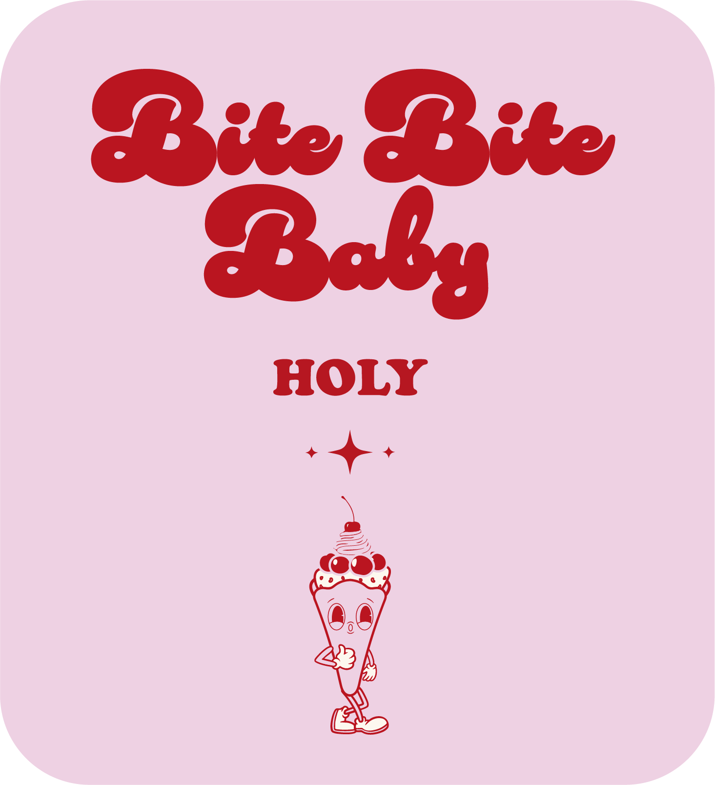
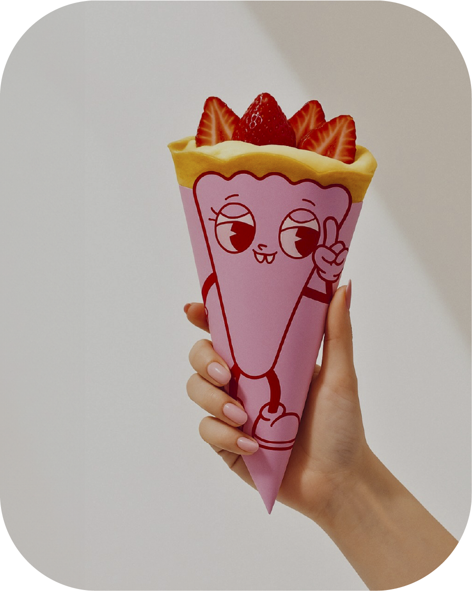
The Creative Process: A strong F&B brand needs a memorable mascot. Instead of using stock vectors, I hand-drew the Holy Crepe character from scratch. The playful, retro-inspired aesthetic immediately sets the brand apart from generic modern minimalist cafes, giving it a soul and an instantly recognizable face that customers love.

Dynamic Logo System
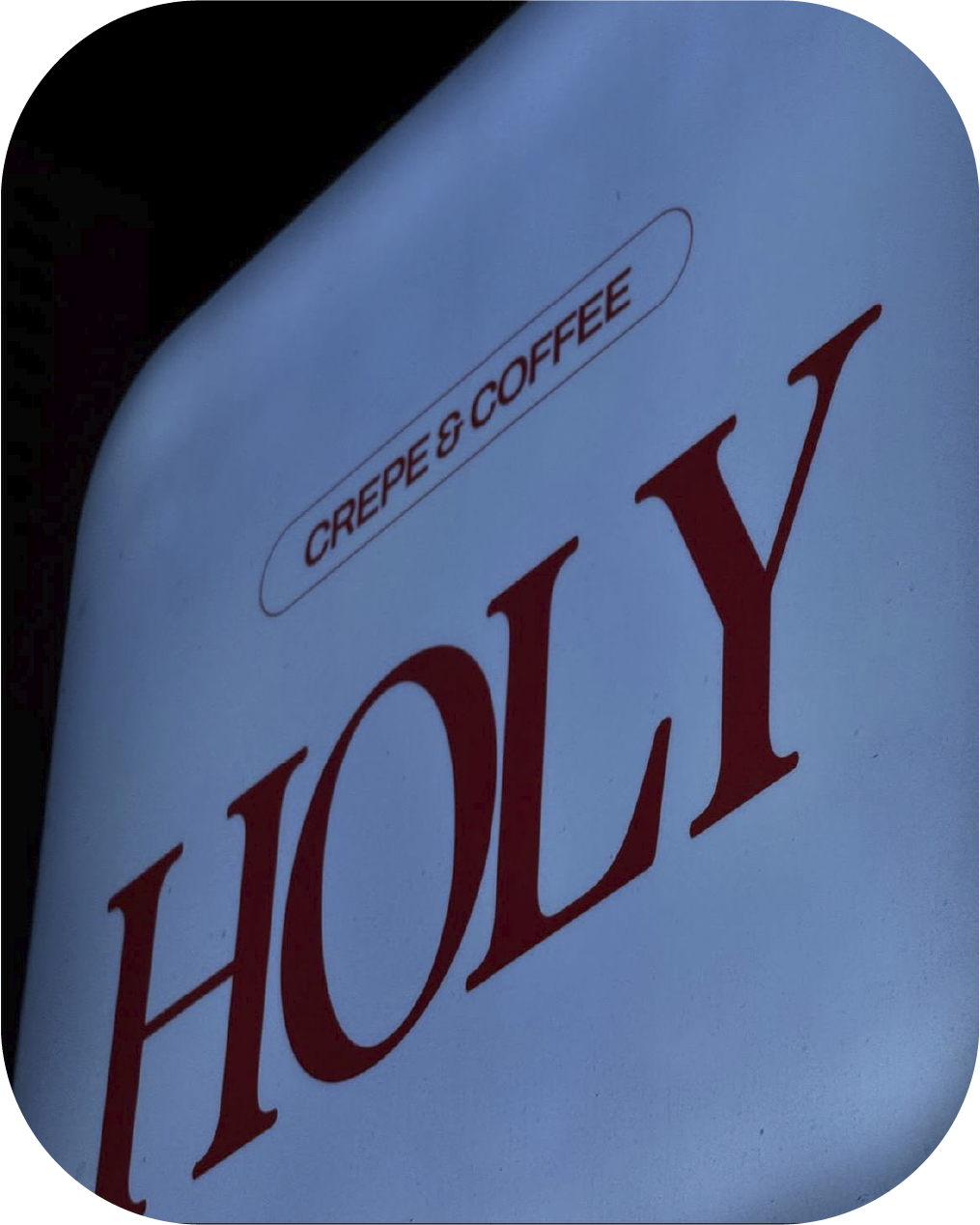
Brand Marks: Instead of a static, single logo, I developed a dynamic logo system. The primary wordmark uses strong serif typography for a premium feel, while secondary badges and responsive variations provide flexibility across different mediums—from tiny coffee cups to large storefront signage.


Strategic Menu Architecture
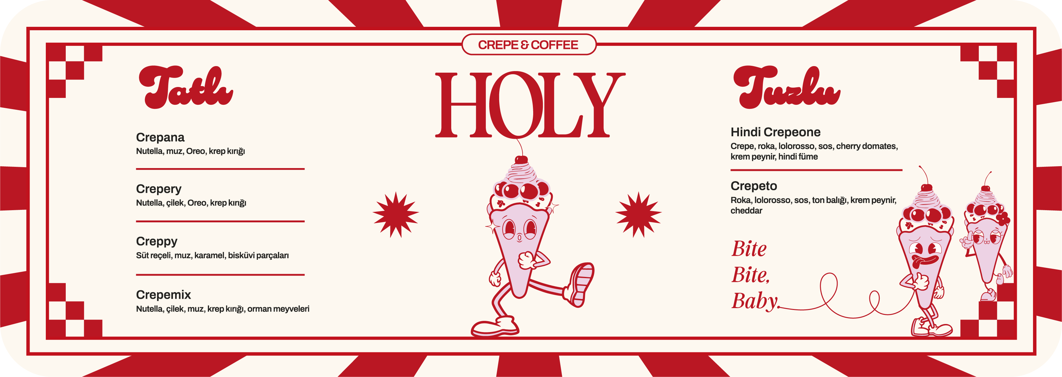
Marketing Design: The menu isn't just a list of items; it's the ultimate sales tool. I structured the menu layout around the bespoke character design, ensuring the typography hierarchy subtly guides the customer's eye toward high-margin items. The combination of playful typography makes the ordering process both fun and frictionless.

Comprehensive Brand Identity
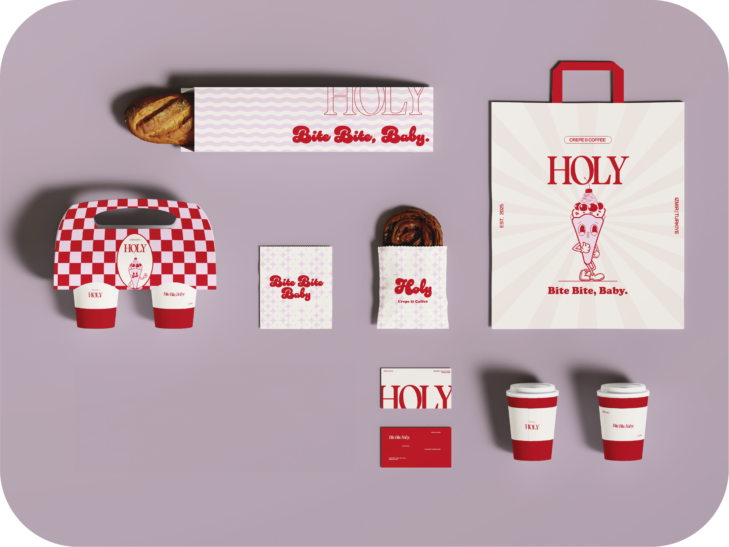
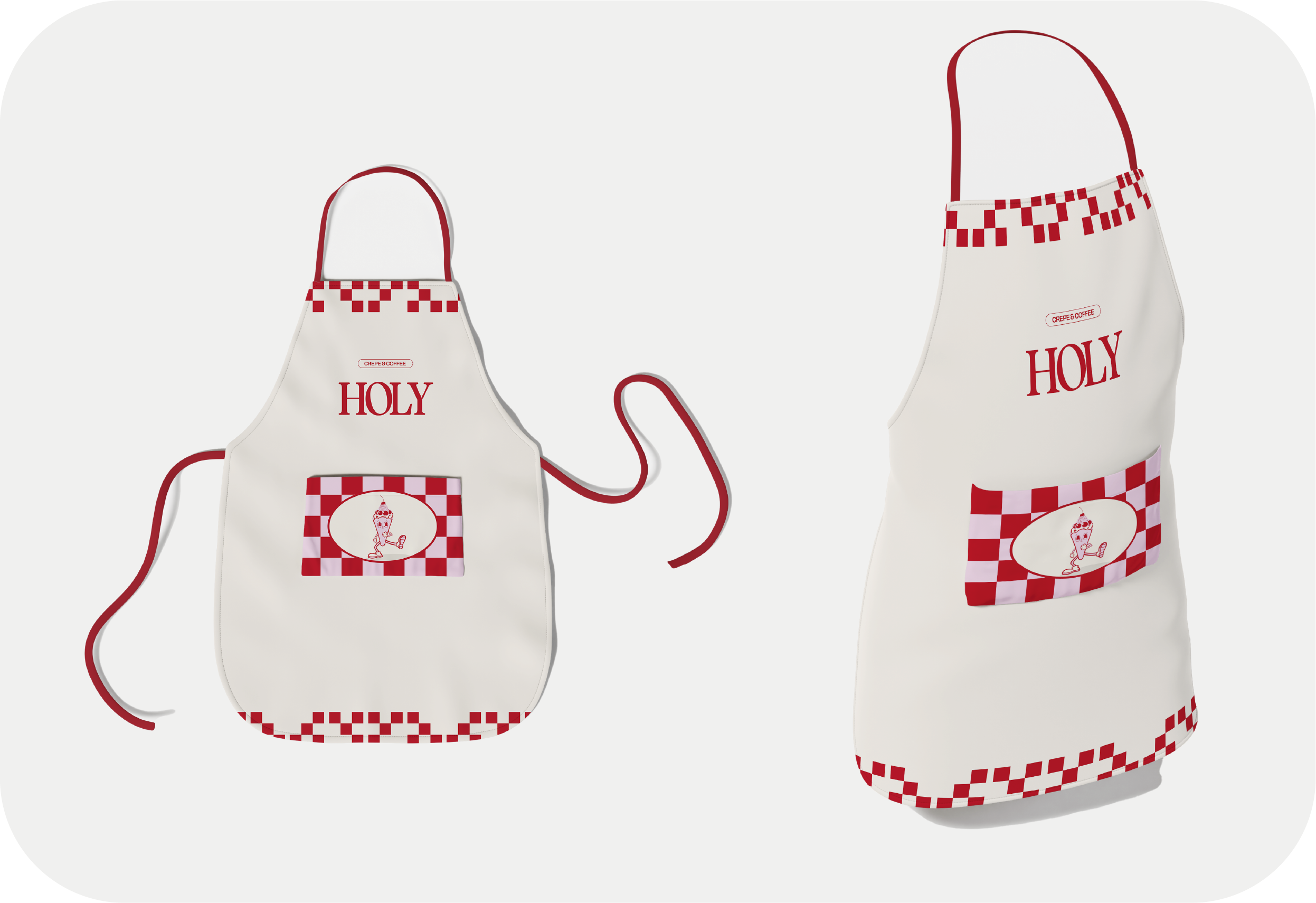
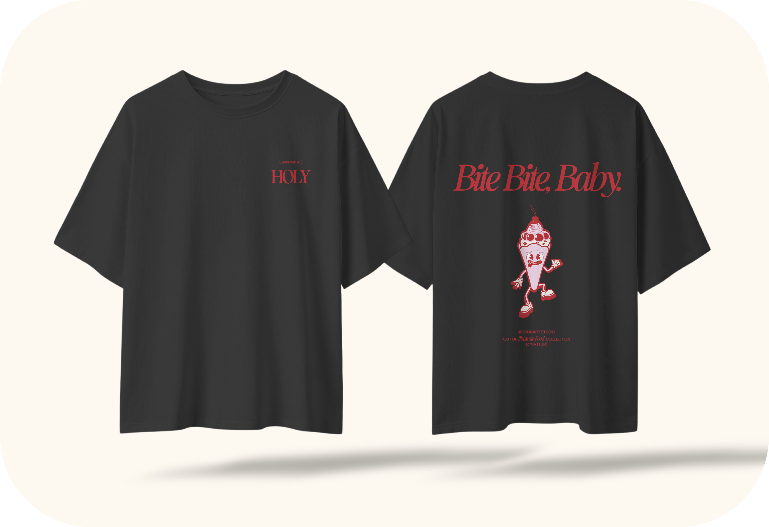
Marketing Design: A brand is only as strong as its application. I designed a complete packaging and identity ecosystem—from custom crepe boxes to coffee cups and paper bags. The checkerboard patterns and bold typography ensure that even a simple takeaway bag acts as a walking billboard for the cafe.
Print & Packaging.
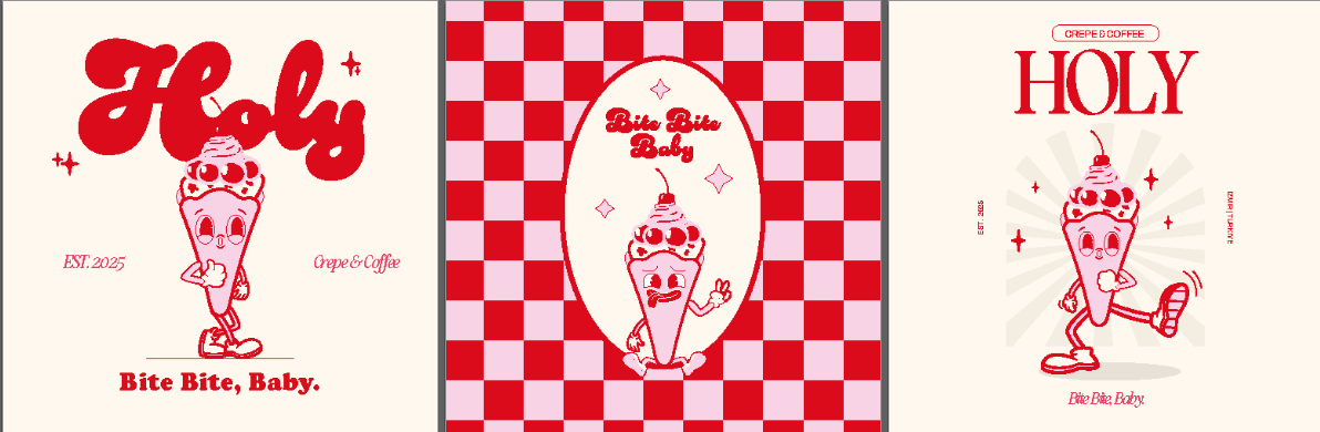
Social Media 3-Grid Strategy
Digital Presence: The visual identity seamlessly translates into the digital world. I designed a cohesive Instagram grid system that balances product photography with the brand's bold red and character illustrations. This ensures their feed doesn't just look like a standard cafe, but an editorial, hype-driven lifestyle brand.